GC Design SystemFoundations GC Design System Start to use Page templates overviewBasic page Components overviewAlertBreadcrumbsButtonCardCheckboxesContainerDate inputDate modifiedDetailsError messageError summaryFieldsetFile uploaderFooterGridHeaderHeadingIconInputLanguage toggleLinkNoticePaginationRadiosScreenreader-onlySearchSelectSide navigationSignatureStepperTableTextTextareaTheme and topic menuTop navigation CSS Shortcuts overview Reset styles Responsive layoutState Box sizingContainer sizingDisplayOverflowPositionVisibility FontFont familyFont sizeFont styleFont weightLine heightLink colourLink sizeLink text decorationList styleText alignText colourText overflowText transformWord break MarginPadding Align contentAlign itemsAlign selfFlexFlex directionFlex growFlex shrinkFlex wrapGapGrid columnsGrid rowsJustify contentJustify itemsJustify selfOrderPlace contentPlace itemsPlace self Background colourBorder colourBorder radiusBorder styleBorder width Icon namesIcon sizeImage CursorPointer eventsTransition Foundations overview About design tokensToken namingUsing tokens ColourSpacingTypography Contact usGet InvolvedFind a demo About design tokens
GC Design System tokens are the smallest building blocks of the design system.
You’ll rarely have to use tokens, since they’re already built into GC Design System components.
On this page
What design tokens are
Design tokens are small, reusable pieces of data that represent style decisions, such as colour, typography, and spacing.
Tokens combine a name with a value. The names follow a structure that describes the decision each token represents. This provides a shared language for designers and developers. Learn how token names are structured.
In the following example, the decision is to use #f2f2f2 as the light background colour.
 In GC Design System, tokens store visual styles and brand requirements for the Government of Canada.
Design tokens are stored in our GitHub token repo and our Figma token library.
How tokens work
In code, our components reference token names instead of their underlying values. You can also reference tokens directly when creating your own styles.
When we update a token’s value, its name stays the same. We make the change once, and it can quickly be passed on to components and styles using that token. You do not have to update the underlying value in your own code.
Tokens are powerful. Using them keeps visual styles consistent across products and services and aligned with Government of Canada brand elements.
Design tokens and CSS Shortcuts
Design tokens and CSS Shortcuts both relate to GC Design System styles, but they serve different purposes.
Design tokens store reusable style decisions. CSS Shortcuts are predefined utility classes for applying common styles. Some CSS Shortcuts classes use design tokens for their values, and they’re automatically updated if a token value changes.
For example, the mb-500 class uses the --gcds-spacing-500 design token for the bottom margin.
Types of design tokens
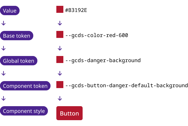
Tokens are organized into 3 types: base, global, and component. These are separate from style categories like colour, spacing, and typography.
Base tokens
Base tokens provide foundational values that other design tokens build on. Their purpose is to provide a limited set of values for other tokens to use.
In GC Design System, base tokens exist only for colour. They store colour values organized in scales, which narrow down every possible colour into a fixed set of choices.

Global tokens
Global tokens store style values that can be used across GC Design System. They are not specific to any component. Their purpose is to make style decisions reusable at the system level.
Some are semantic, which means their name describes what the style is for. Others use a scale to identify the value, like --gcds-spacing-600.
Global tokens can reference other tokens or store a value directly.

Component tokens
Component tokens capture design decisions for a specific GC Design System component. Their purpose is to apply those decisions to specific parts and states of the component.
They’re semantic, with names that describe the intent of the style. They reference global or base tokens for their values.
Deciding if you need design tokens
You do not necessarily have to use design tokens directly. We can help you decide when to use them.
Learn when to use tokens
Help us improve Have questions or a request? Give feedback on our contact form. Something's wrong? Raise it through GitHub with an account. You'll have access to the team's direct responses, progress made on your issue, and issues raised by others. Give feedback Report an issue on GitHub 2026-02-12